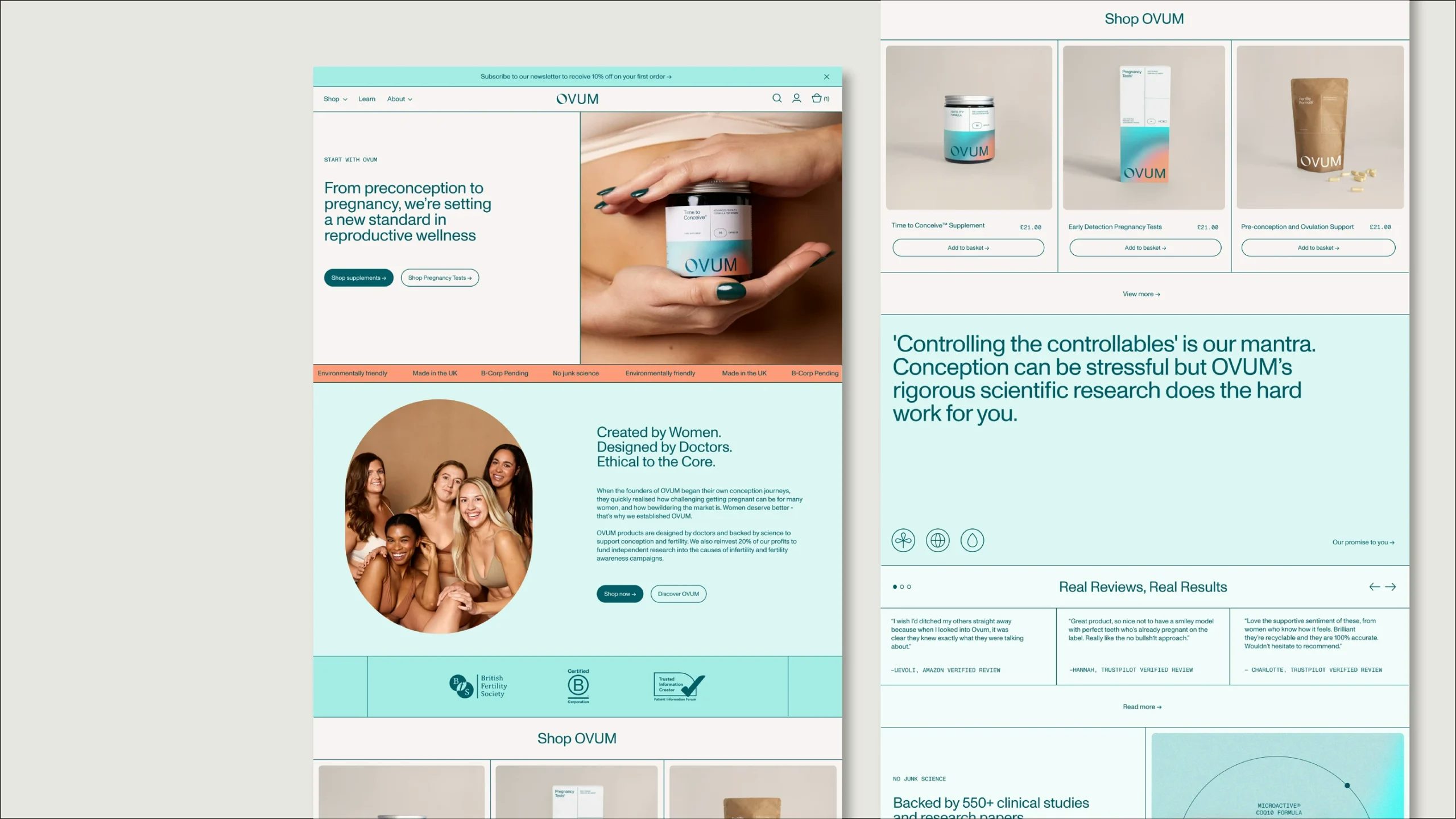
Reproductive And Fertility Wellness
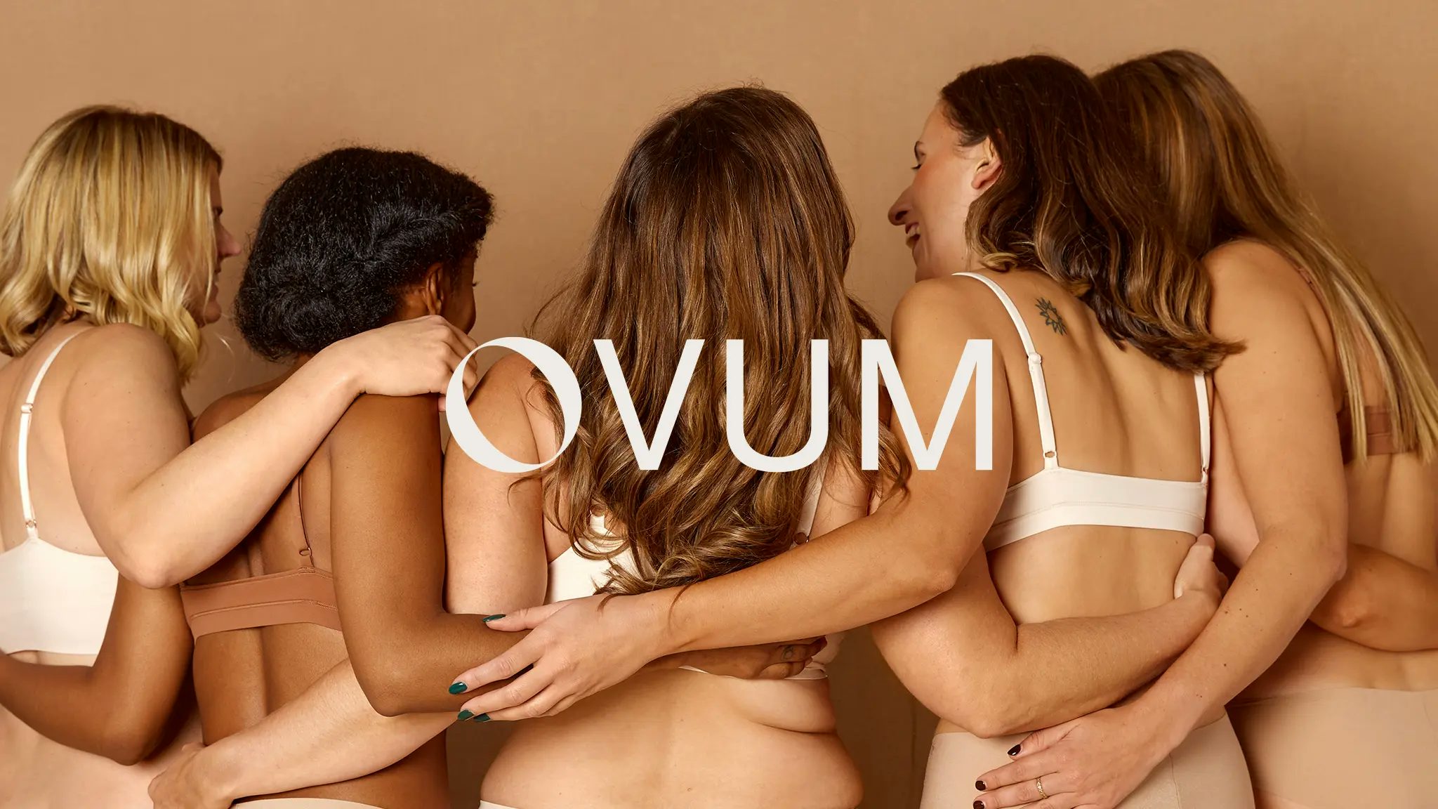
Synopsis: OVUM is a female-founded, science-driven company with a simple goal: to shorten time to pregnancy and assist the conception journey with rigorously-tested, best-in-class products, and accurate scientific information that’s simple to understand.
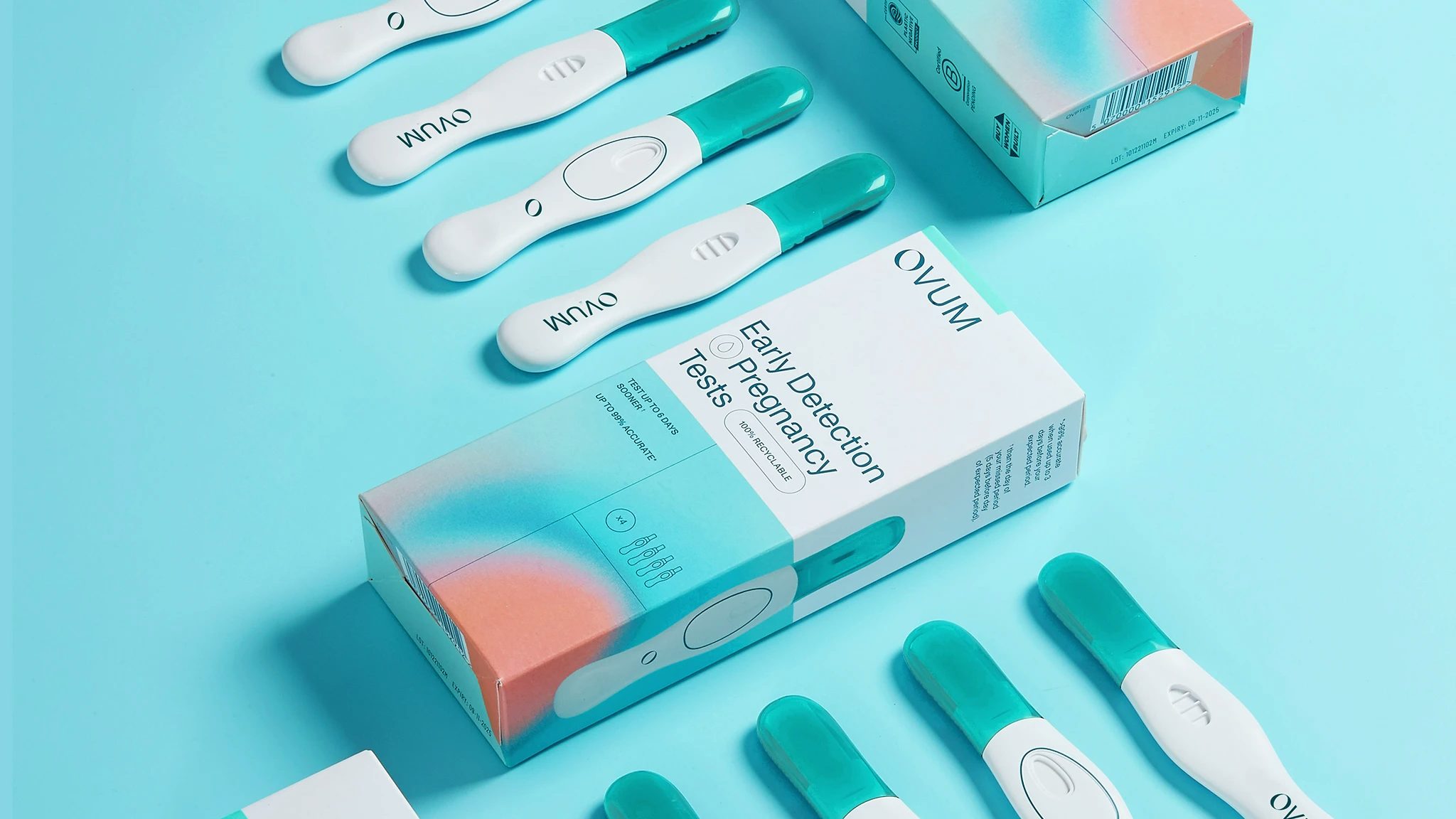
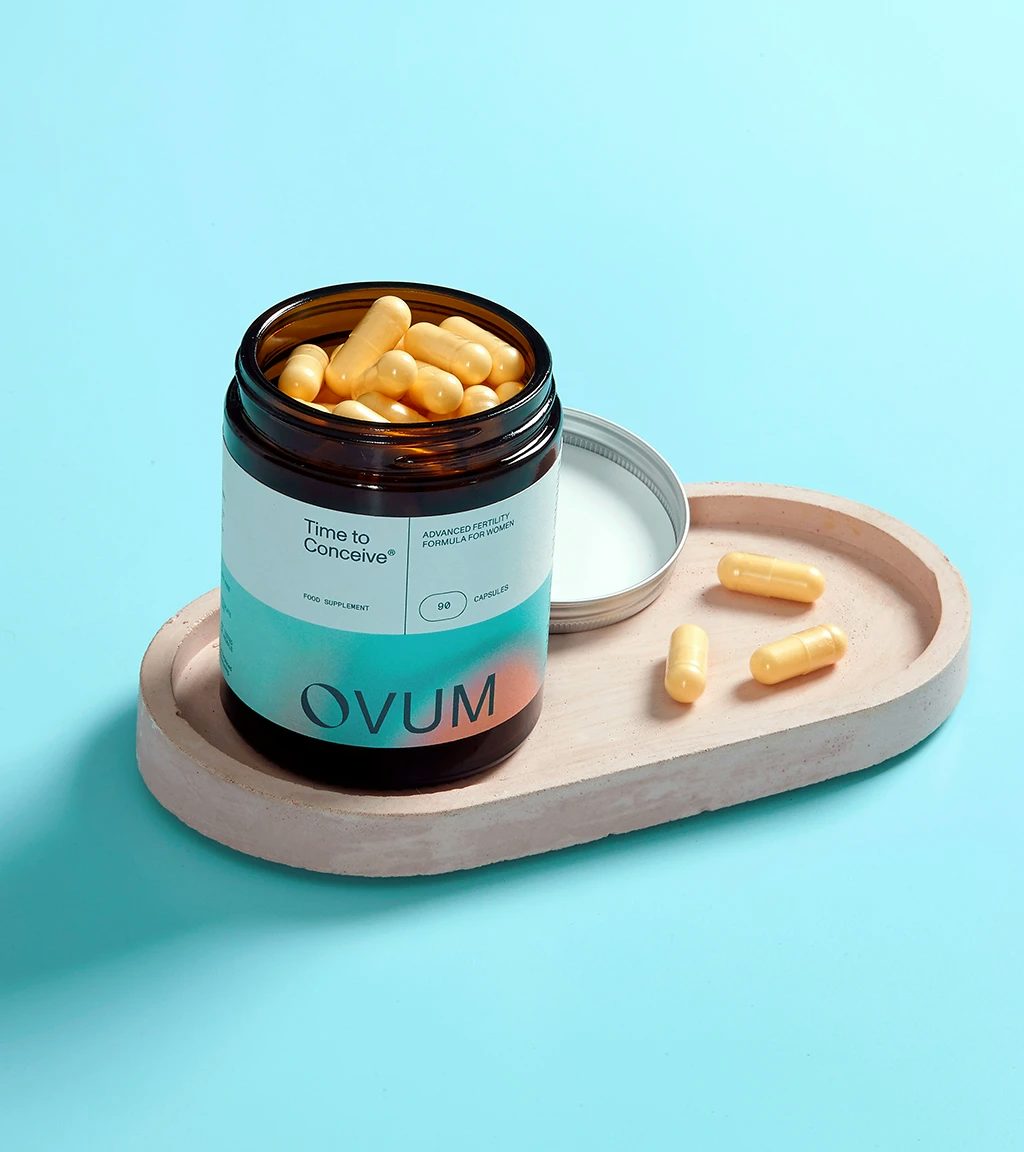
OVUM products are designed by doctors and backed by science to support conception and fertility. OVUM also reinvests 20% of its profits to fund independent research into the causes of infertility and fertility awareness campaigns.

Challenge: The challenge was twofold: this is an area that is not only highly sensitive in nature, but awash with pseudoscience targeting vulnerable women trying to conceive.
OVUM’s has a principled stance on protecting its customers, and needed a brand aesthetic that would capture the science-led nature of the business, but maintain empathy and understanding for the experiences of its customers.
Insight and idea: We worked closely with the founders to unearth deep insights into what they wanted to achieve, to draw out not only a powerful brand, but a strategy that matched their ambitions.
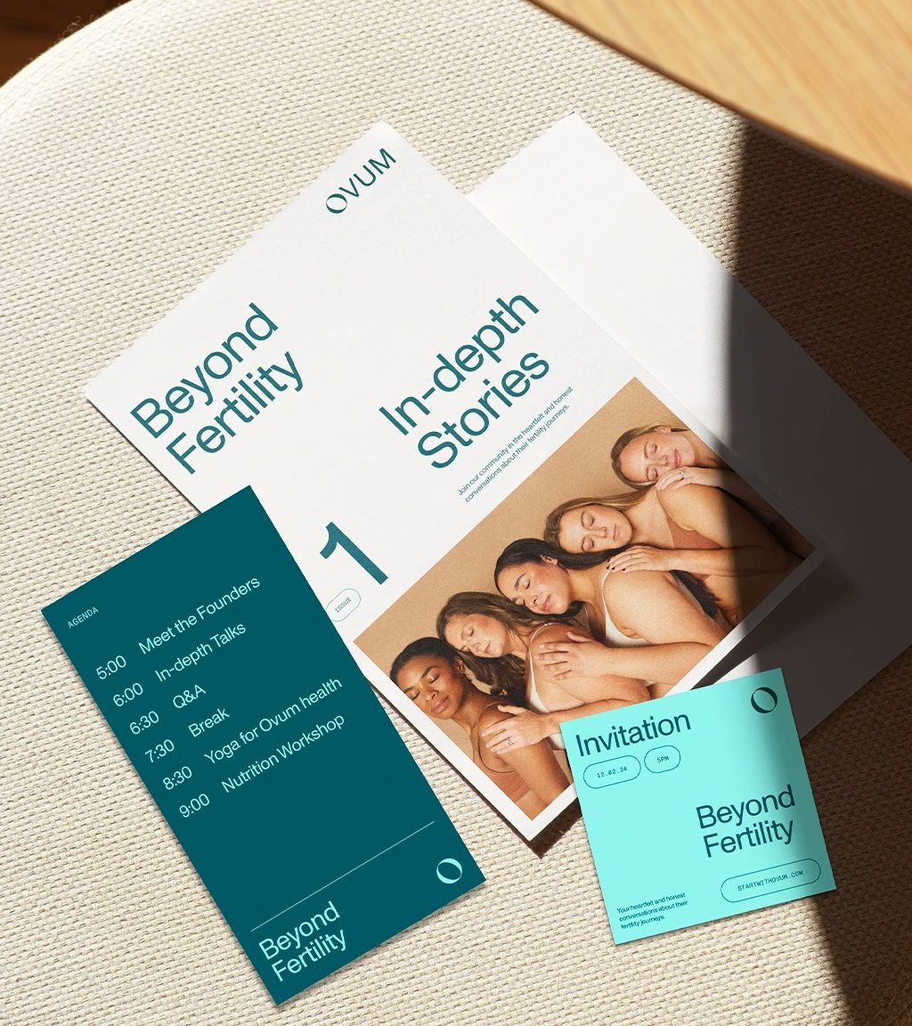
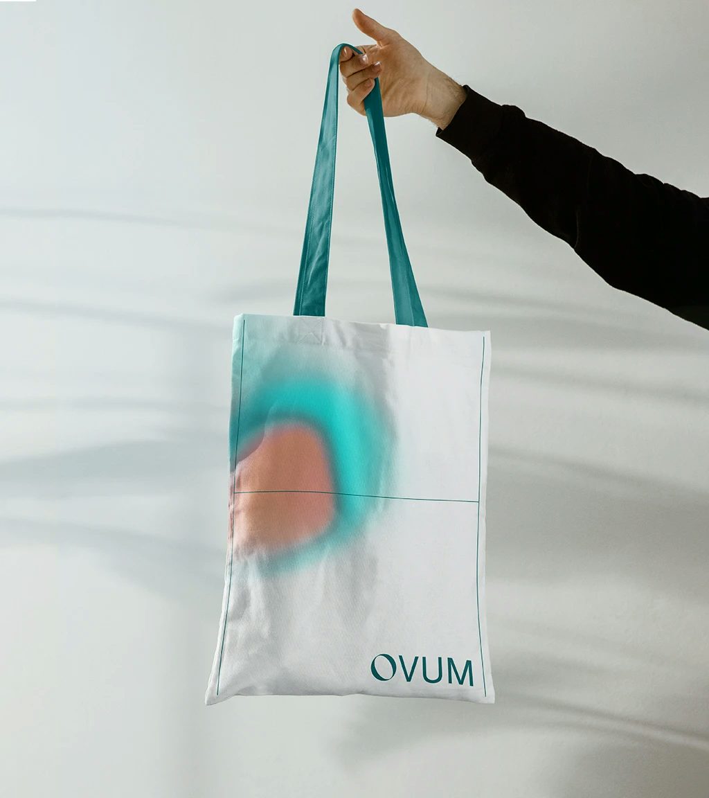
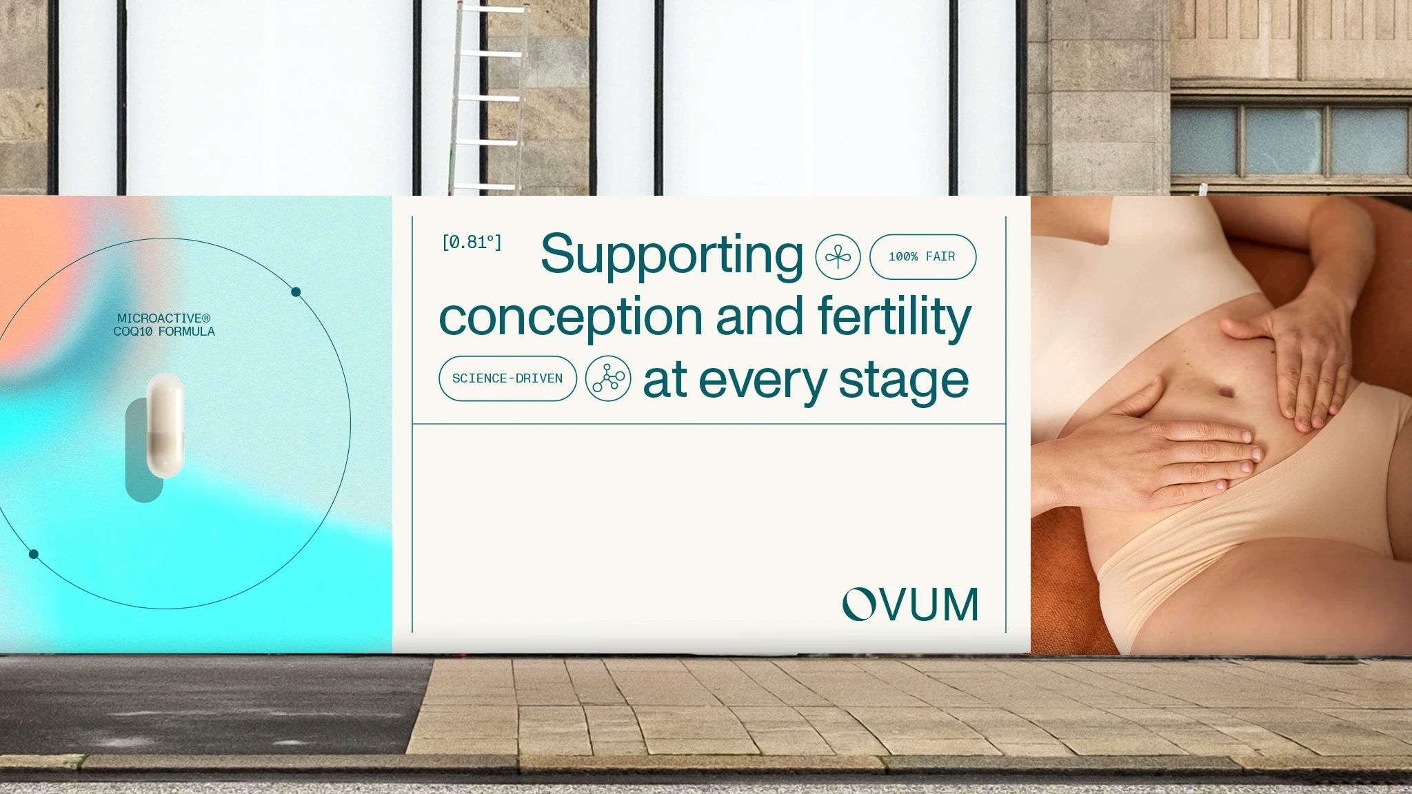
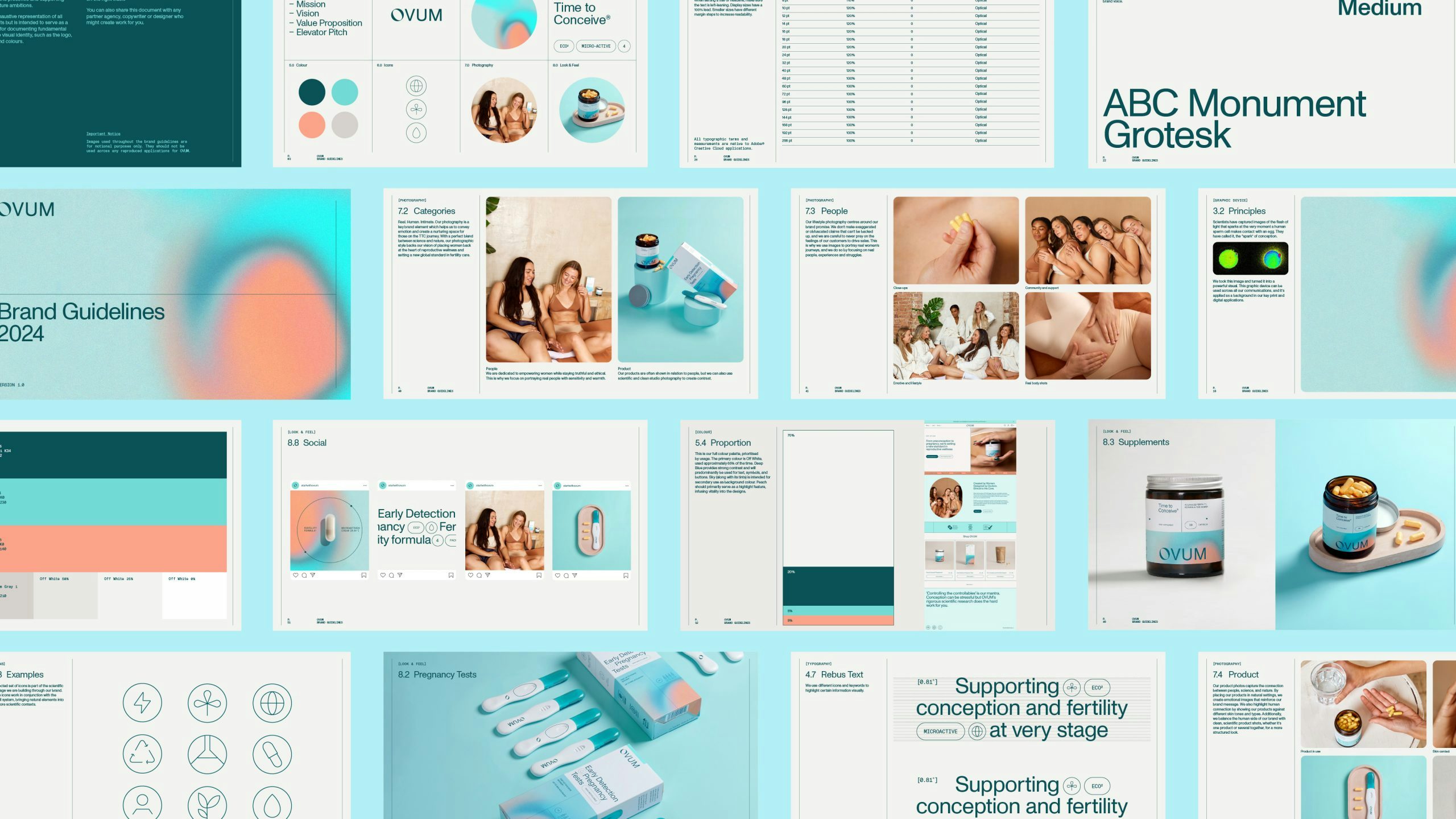
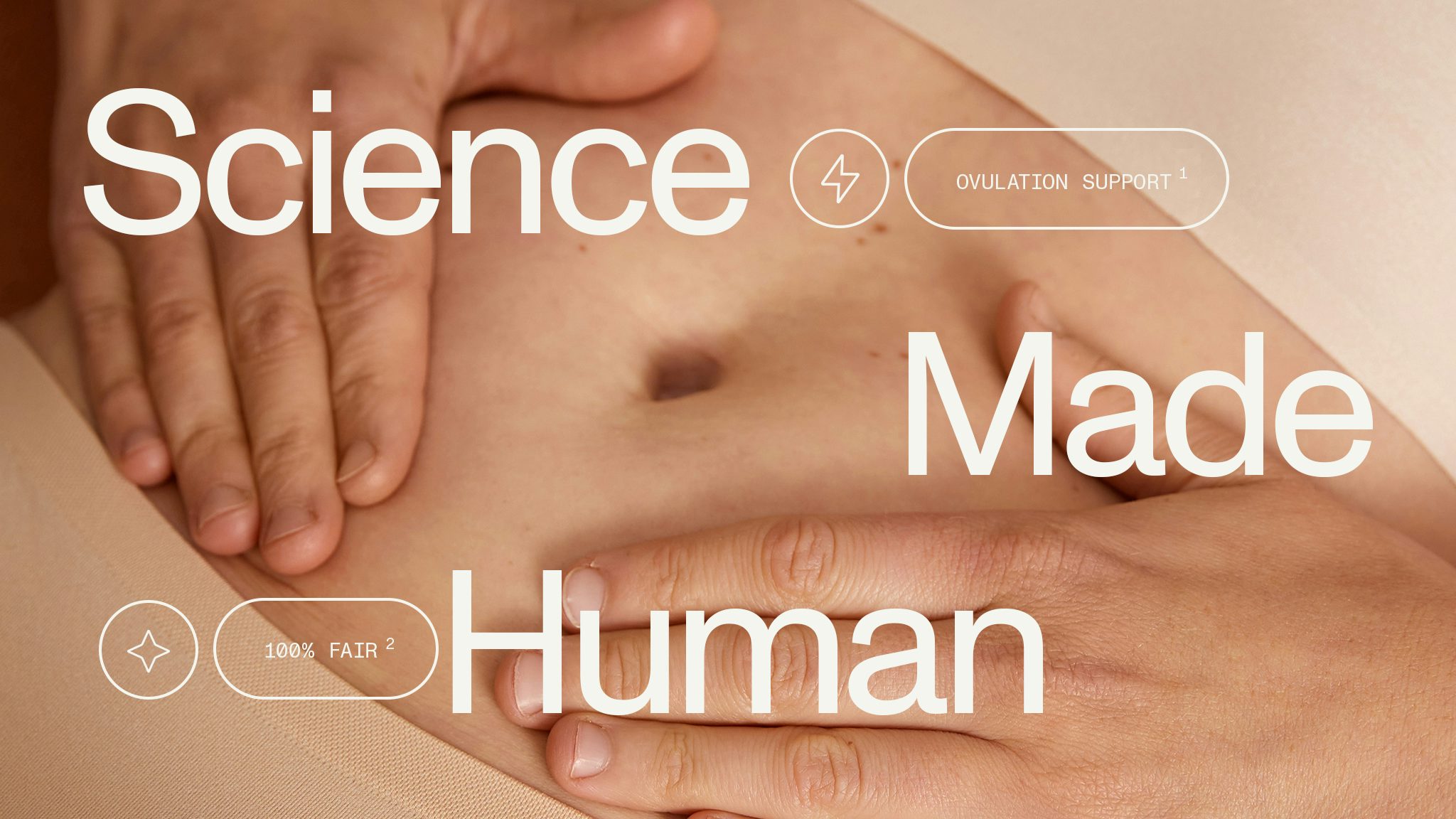
Expression: The visual anchor of the brand identity is rooted in the science behind their work.
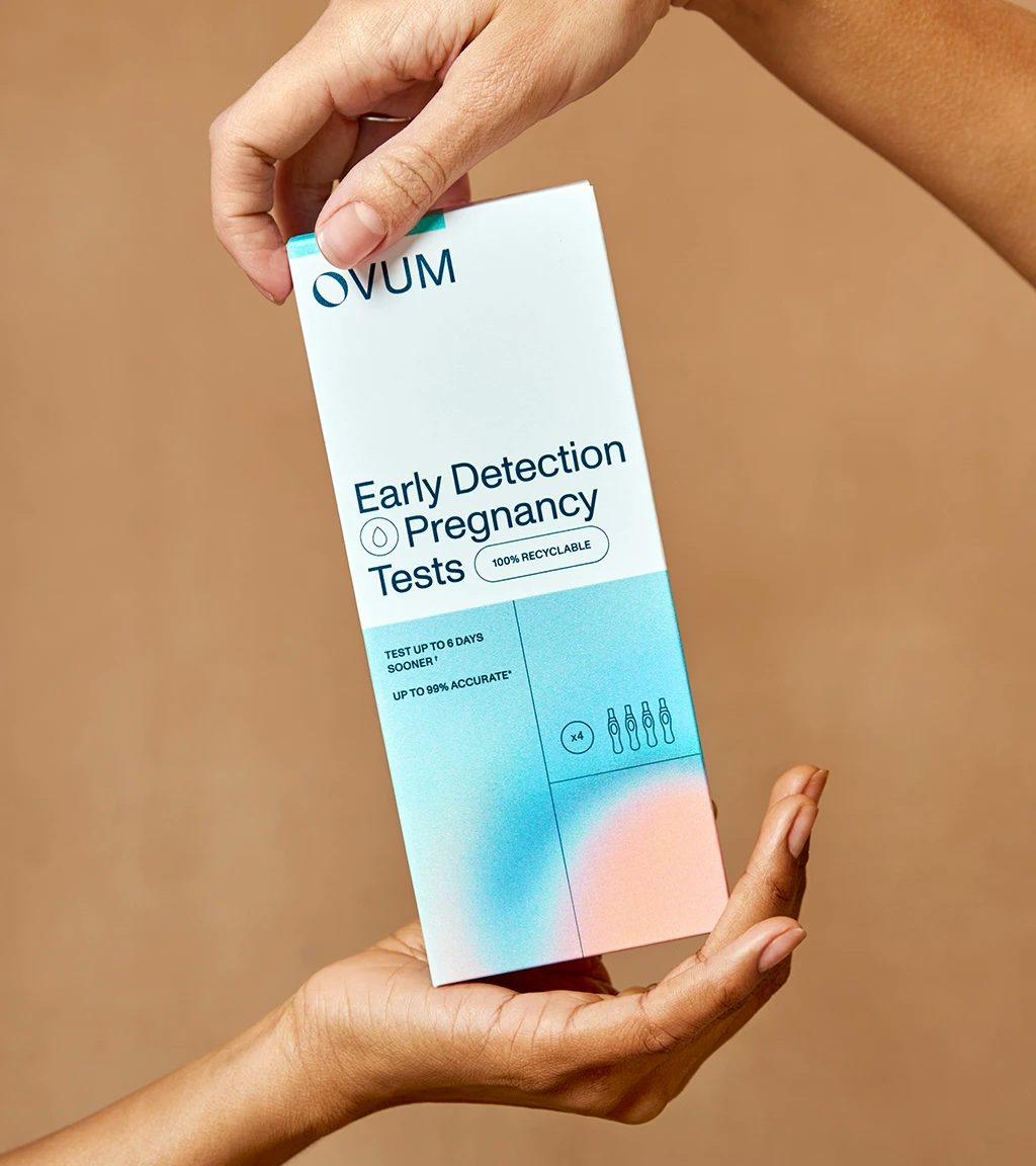
The ‘spark of conception’ identified by reproductive scientists is represented in the brand pattern and across brand applications, with the ‘O’ of the logo based on a cross sectional view of the foetal position.
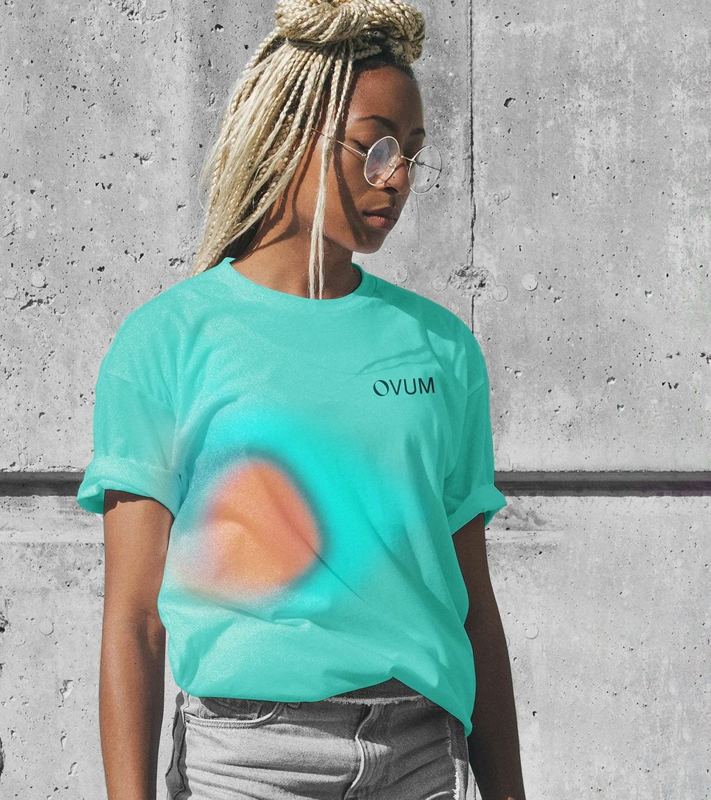
New colour palette is a hybrid of vibrant blue and peach, the blue representing scientific rigour while the peach adds balance with gentle maternal tones.
The typography took on a more recessive role in the brand bringing calm and clarity with a supporting Mono font for added technical prowess.