Granite Asia – Asia's leading investment platform
- Services:
- Art Direction
- Brand Rollout
- Branding
- Identity
- UI Design
- Video
- Website
Rundown: Granite Asia is a leading multi-asset investment platform partnering with visionary businesses seeking to amplify their potential in the world’s fastest-growing region.


The landscape for investing has never been more complex or exciting. Valuable companies are staying private for longer, while investors are looking for greater liquidity. To capture the opportunity, new financing structures are needed.
Granite Asia’s mission is to fuel purposeful growth with new financing structures that empower positive impact.
We partnered with Studio Everywhere to help Granite develop a sophisticated brand and website that not only reflects their expertise but also positions them for the next season of growth, helping them engage with both investors and founders in a meaningful way.


Previously operated under the umbrella of GGVC (GG Venture Capital), a global investment firm investing in some of the world’s biggest companies including Slack, Grab, and Airbnb, Granite Asia was established to maximise the growing opportunities in the region.
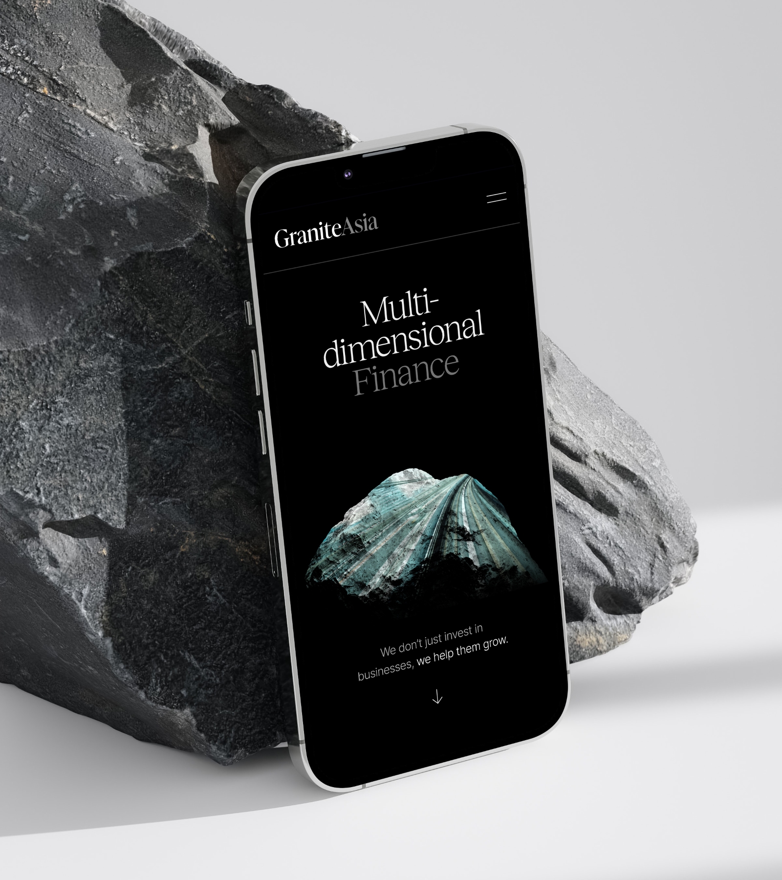
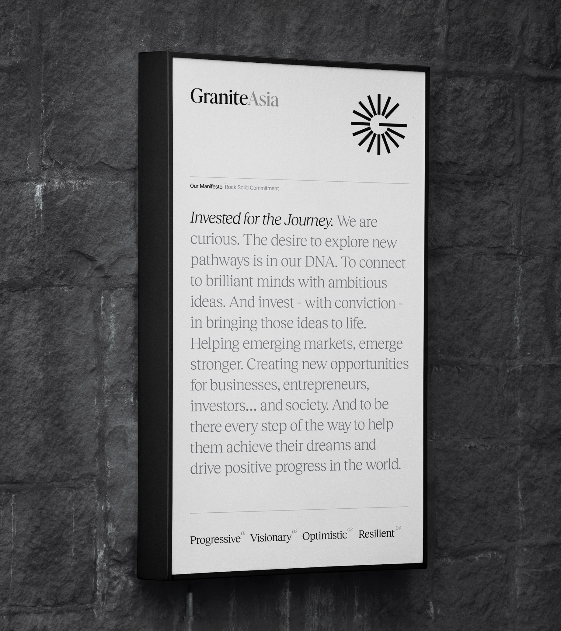
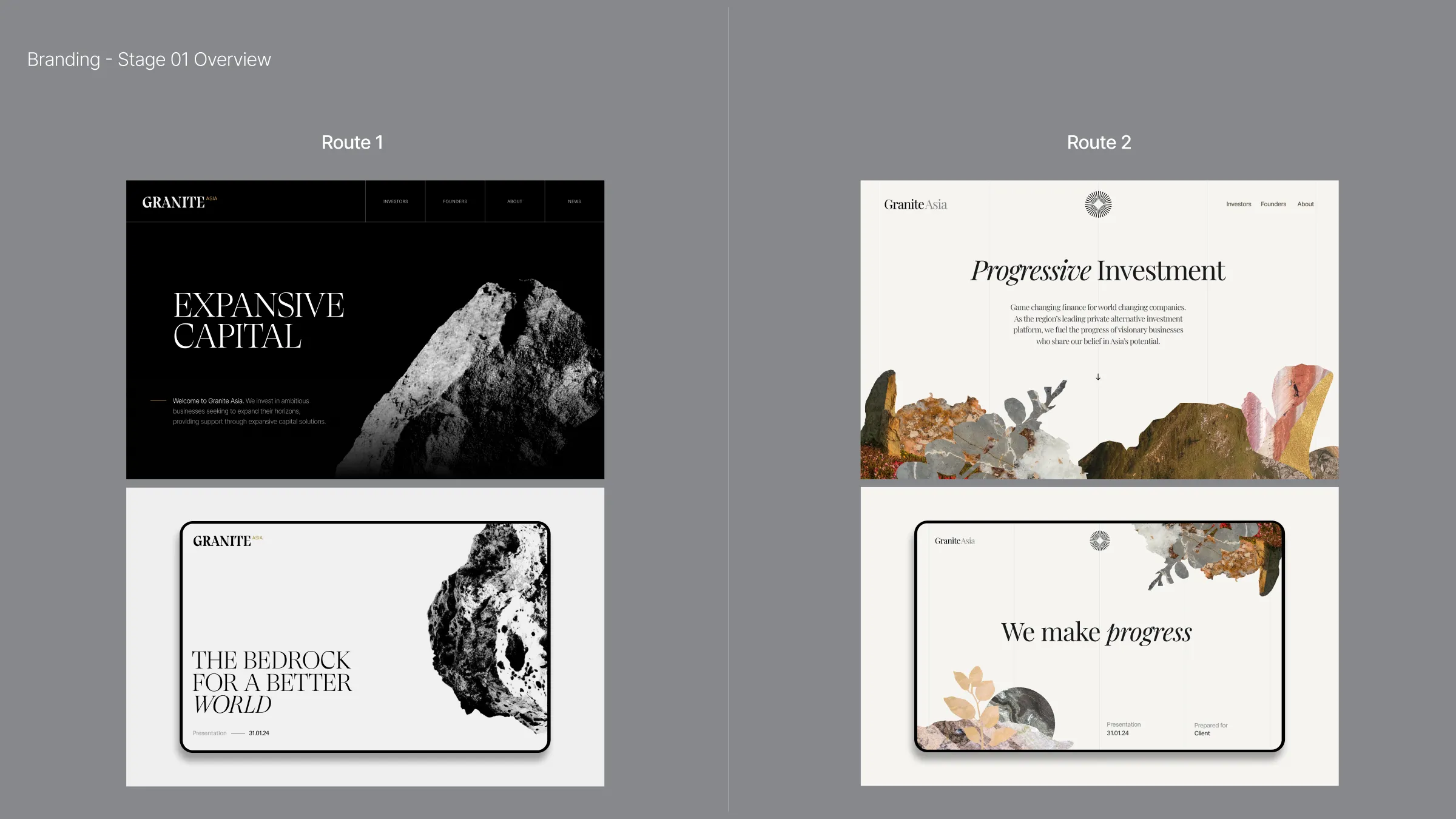
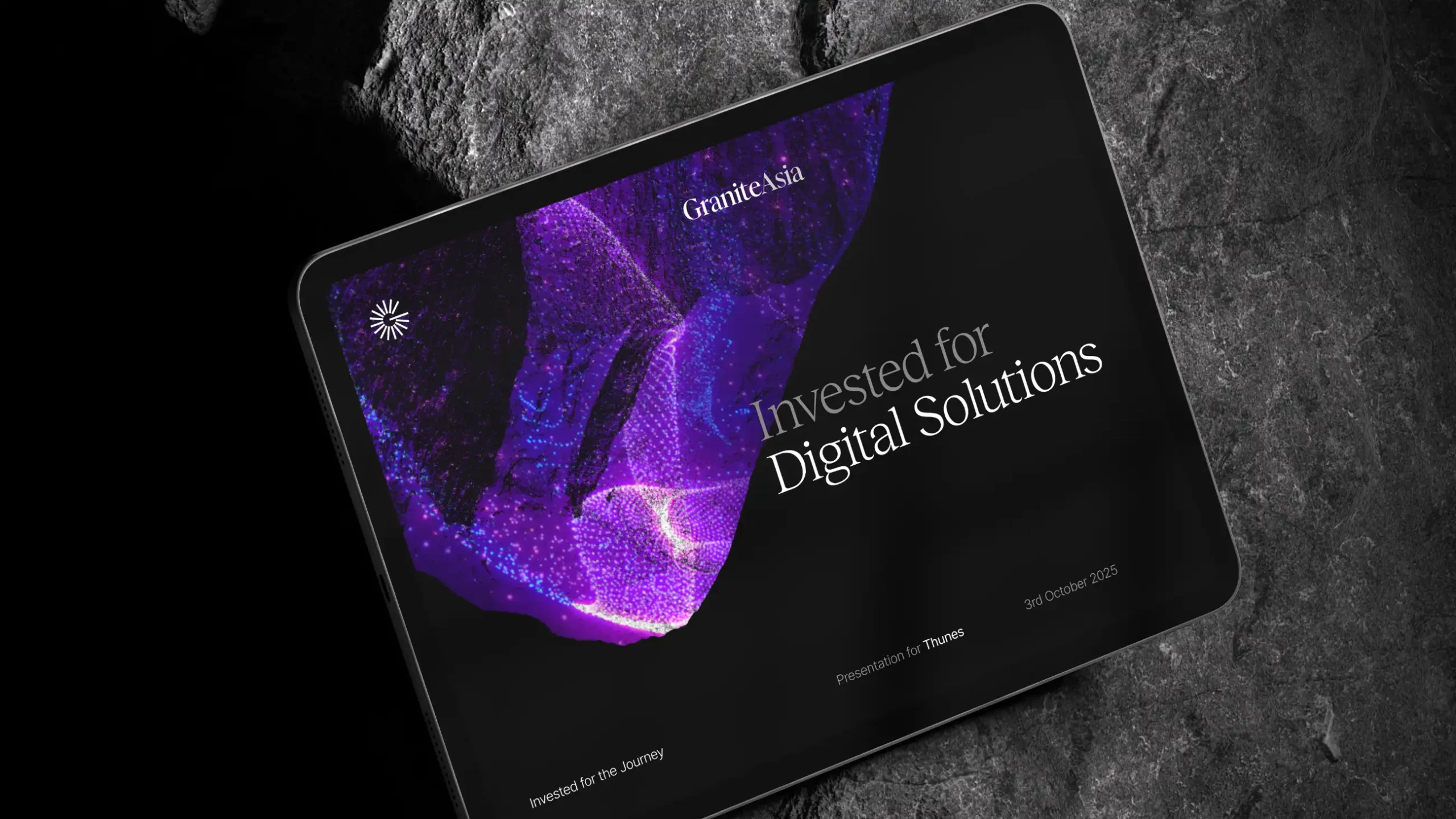
With a newly-defined brand promise of ‘Invested, for the Journey’, it needed a sophisticated brand that would differentiate from its previous iteration and appeal to a critical audience of CEOs and founders, offering a reassuring sense of gravitas and trust.

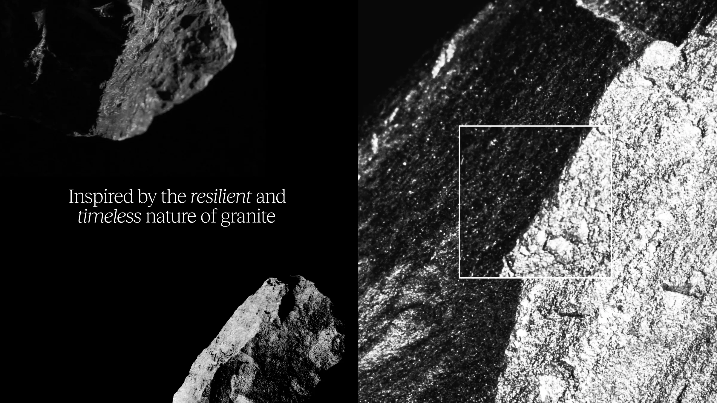
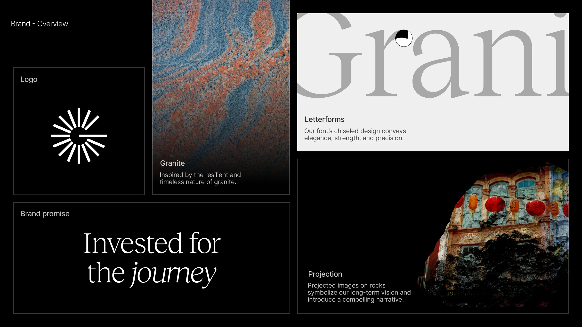
Inspired by the name ‘Granite’, we used the company’s founding principle of commitment to a journey as our starting point.
With our insights into the wants and needs of investors and founders, we knew we needed to strike the right balance between experience and passion.
Granite is raw, powerful, and valuable, with the potential to be polished and transformed into an object of beauty with the right skills, craft and patience – the space between solidity and passion is where we wanted the brand to be.


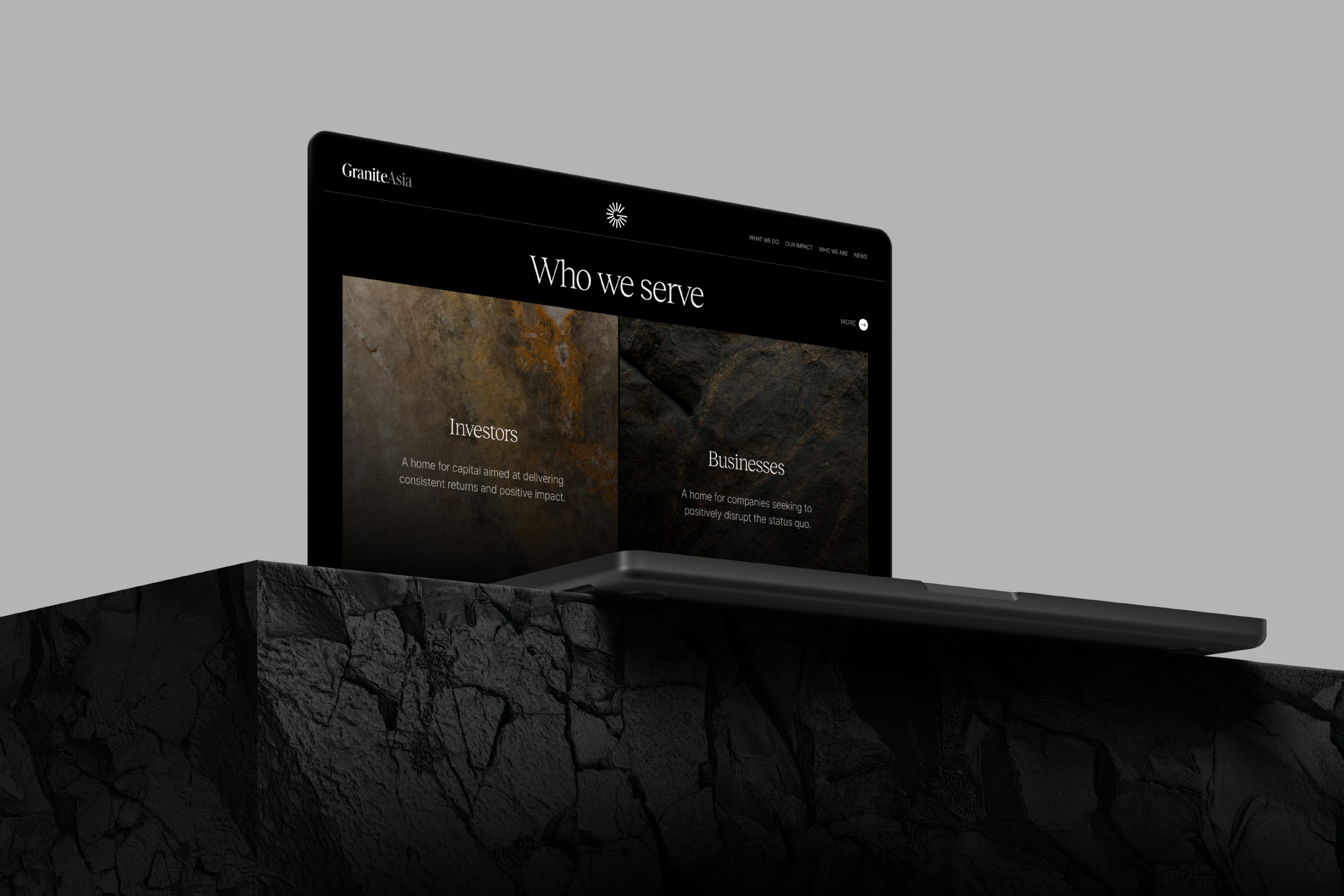
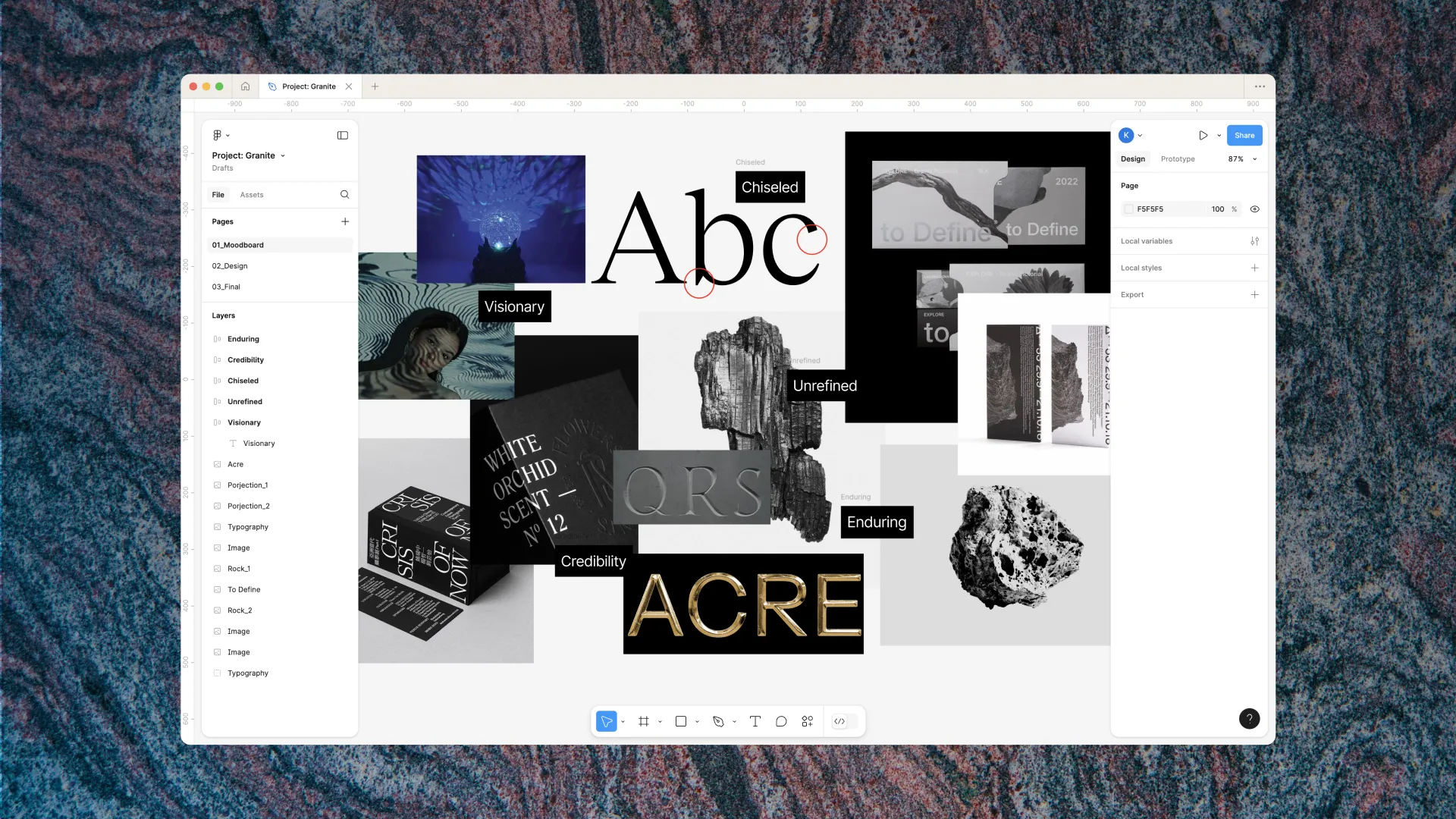
The brand leads with powerful imagery and media depicting Granite Asia’s core offerings and approach projected onto raw, untempered granite rocks.
The projections portray a timelessness to the company’s mission, glimpsing the future and looking towards the journey ahead, built on the solid foundations of global experience. This sense of quality is enhanced by polished granite textures that draw in a more luxurious sense of refinement.
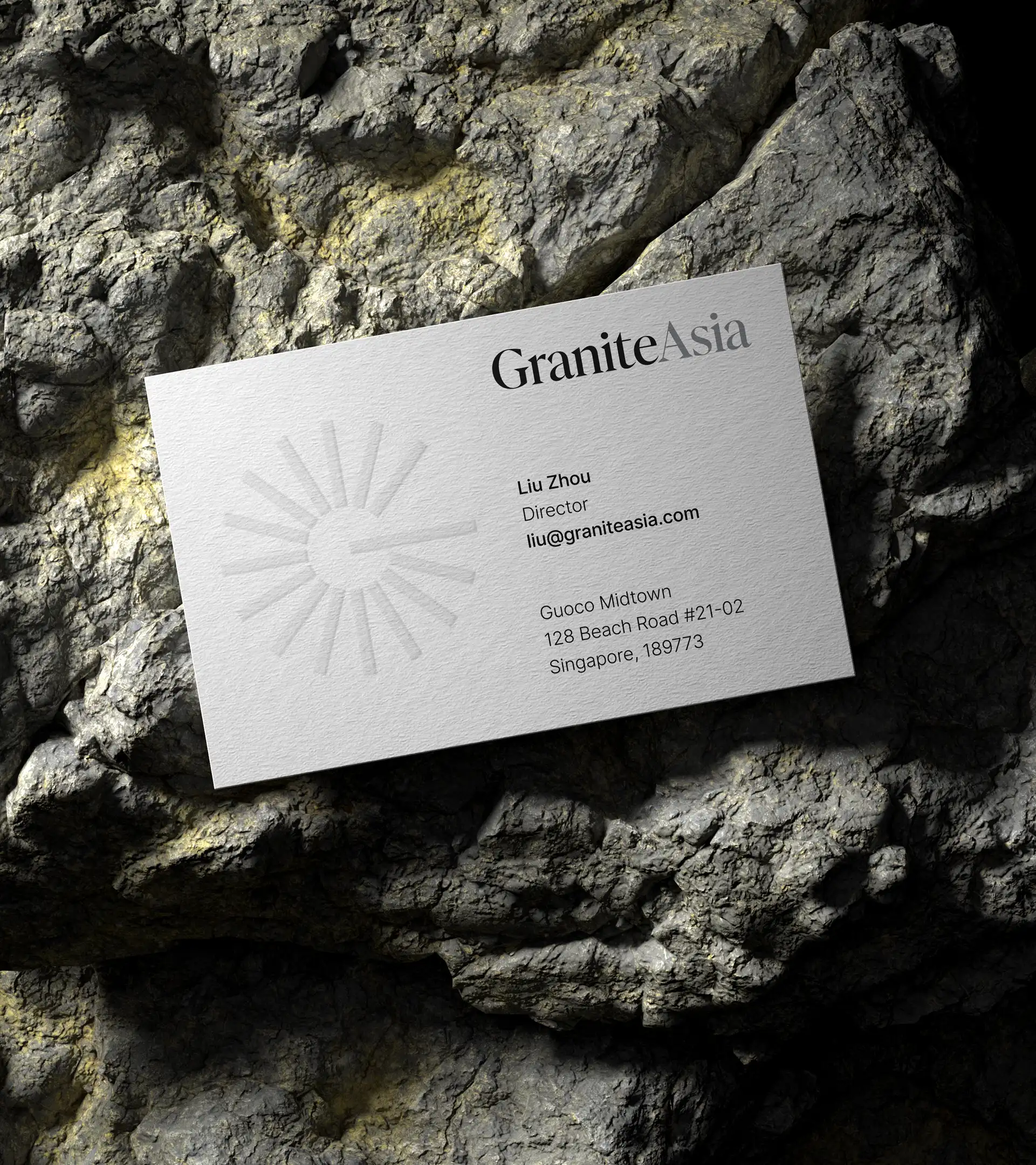
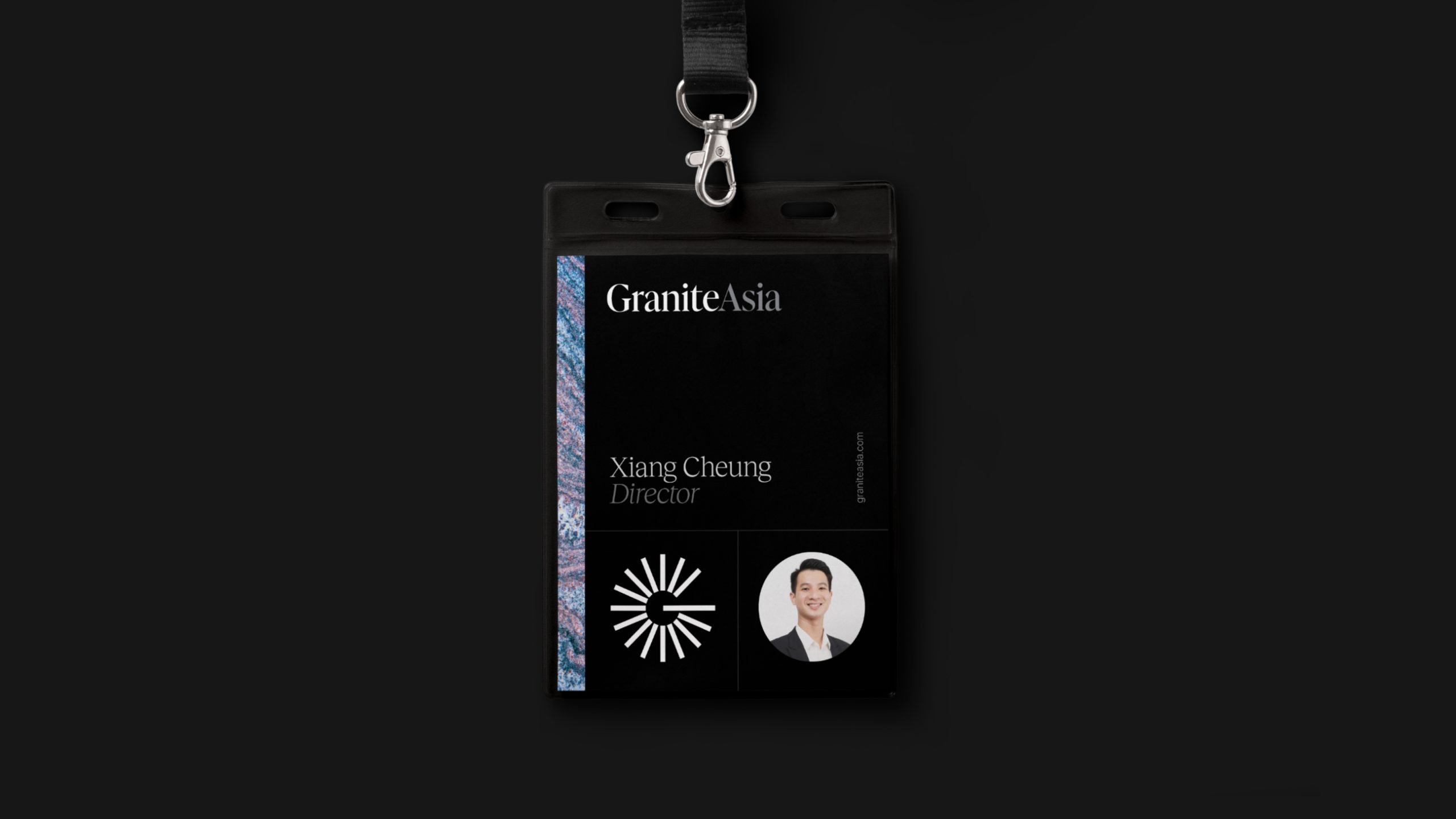
The logo, featuring the G, embodies the notion of time, slabs of granite and an unfolding portfolio, while the typography is a slick, chiselled serif font drawing in the brand name with a professional, trustworthy appeal. The resulting brand communicates strong foundations for growth with a reassuringly luxe feel.


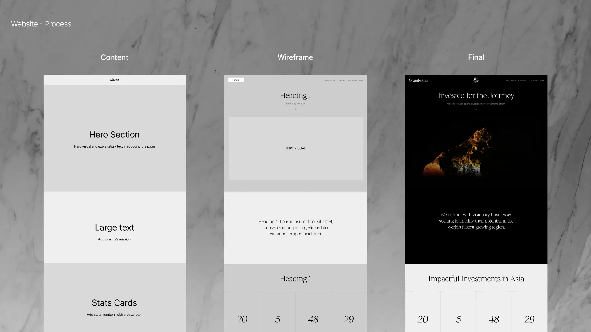
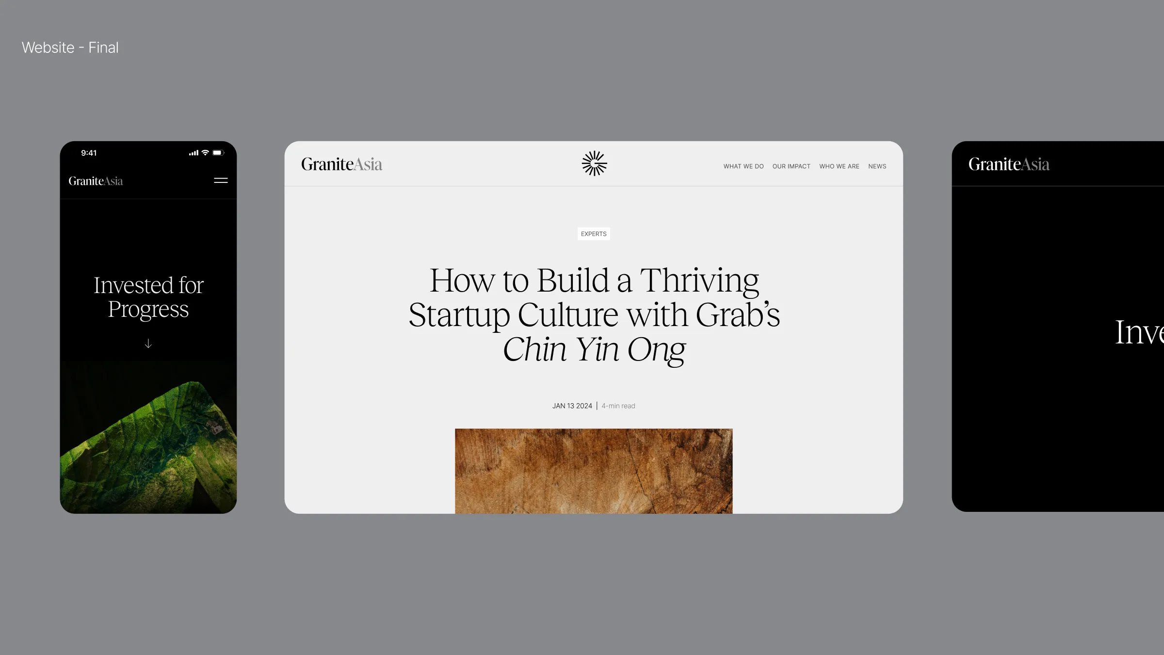
Granite’s new website reflects the brand with a focus on elegance and clarity, presenting their services in a clean, intuitive layout.
We focused on the user experience, ensuring complex information was easily accessible while maintaining a premium and refined aesthetic.


Studio Everywhere — Brand strategy


