Chip Financial – Save and invest with Chip, your wealth App
- Services:
- Art Direction
- Brand Rollout
- Brand Update
- Campaign
- Messaging
- Tone of Voice
- UI Design
- Video

Rundown: Chip is a fast-growing UK-based savings and investment platform, helping over half a million users grow their money through smart automation. With a focus on simplicity and performance, Chip is redefining personal finance by combining intelligent tech, sleek design, and financial expertise in one powerful platform.


Being an ambitious fintech challenger to the big banks, they are already earning recognition with awards such as Best Personal Finance App at the 2022 British Bank Awards and Best Savings Provider at the 2023 Finder Awards.
We partnered with Chip to push their brand further—sharpening their voice, refining the visuals, and giving them the standout presence they deserve. The result is a confident, cohesive identity that reinforces their position as a serious player in the fintech space.

As Chip’s product evolved, so did its audience—requiring a brand that could grow and adapt alongside their changing needs and aspirations.
Chip approached us at a pivotal moment in their journey. Having gained market recognition as a saving and investing platform, they needed to evolve the overall tone of the brand to appeal to a new and more mature audience of 30-45 year olds, financially stable, not looking to ‘get rich quick’ but start making bigger financial decisions to build a future for themselves and their loved ones.


Chip’s ethos, ‘to build wealth for our generation’ was something they wanted to bring to life in the visual system and communicate across all platforms. The idea of representing meaningful growth was our starting point for the work, to capture the trust of its desired new audience.


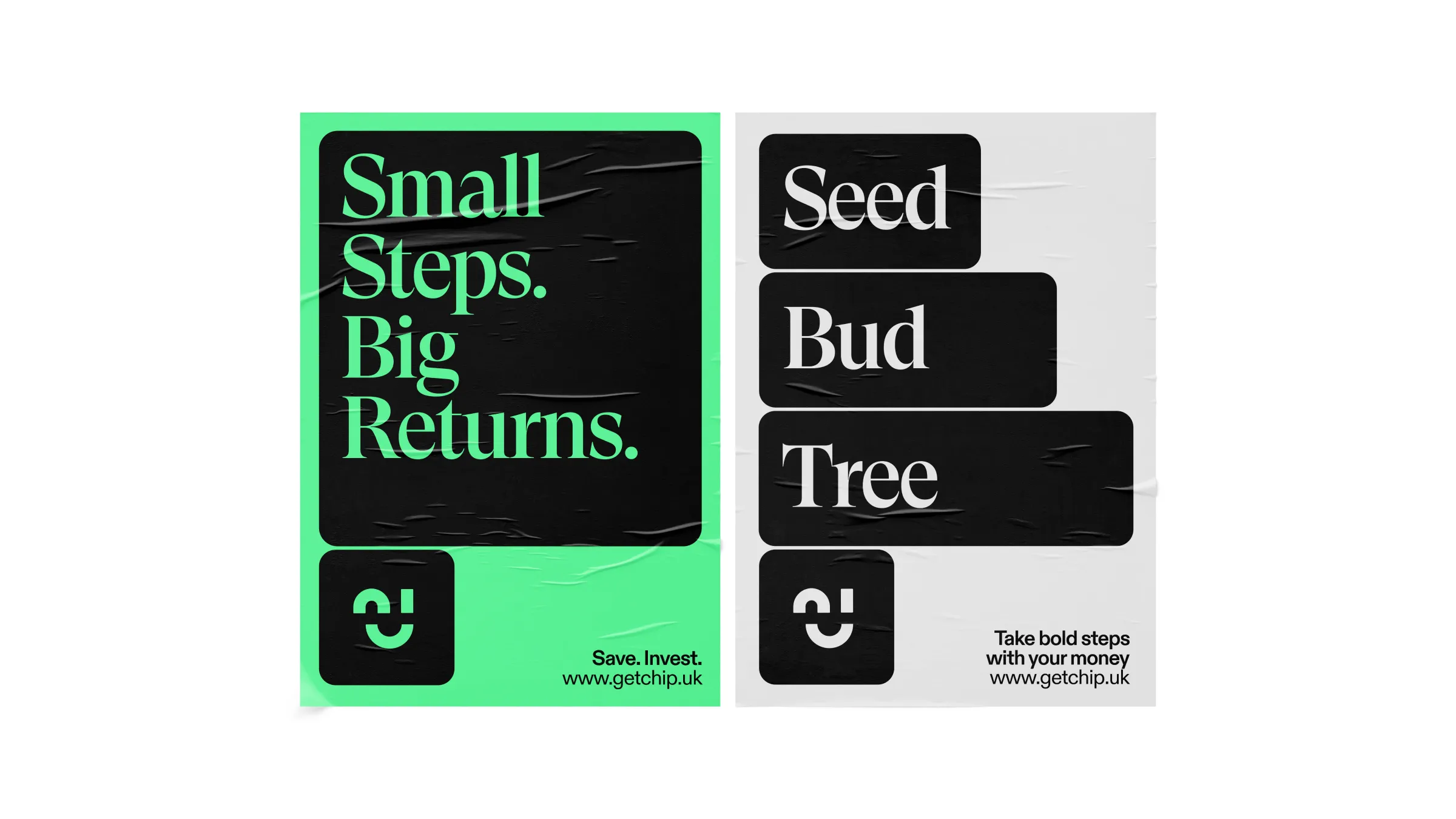
The result is a flexible visual system which grows and compounds the same way money does – this becomes a robust, adaptive device which can be used to contain messaging and imagery across all of their communications.
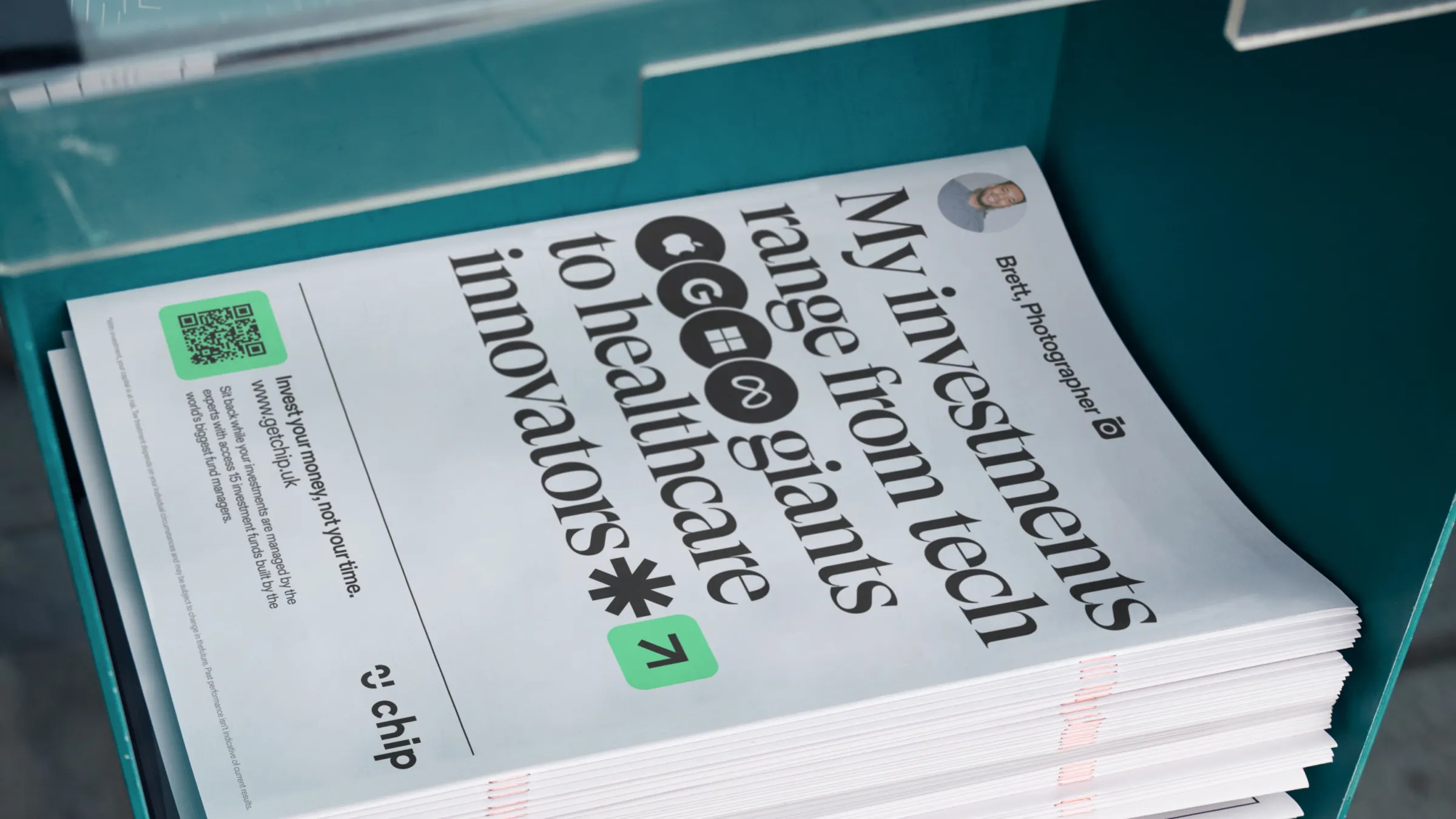
The typography was influenced by editorial publications such as The FT and The Guardian, moving away from the friendly sans serif to a more sophisticated serif, aligning with the tastes of their mature audience, and making the brand experience feel more financially trustworthy.
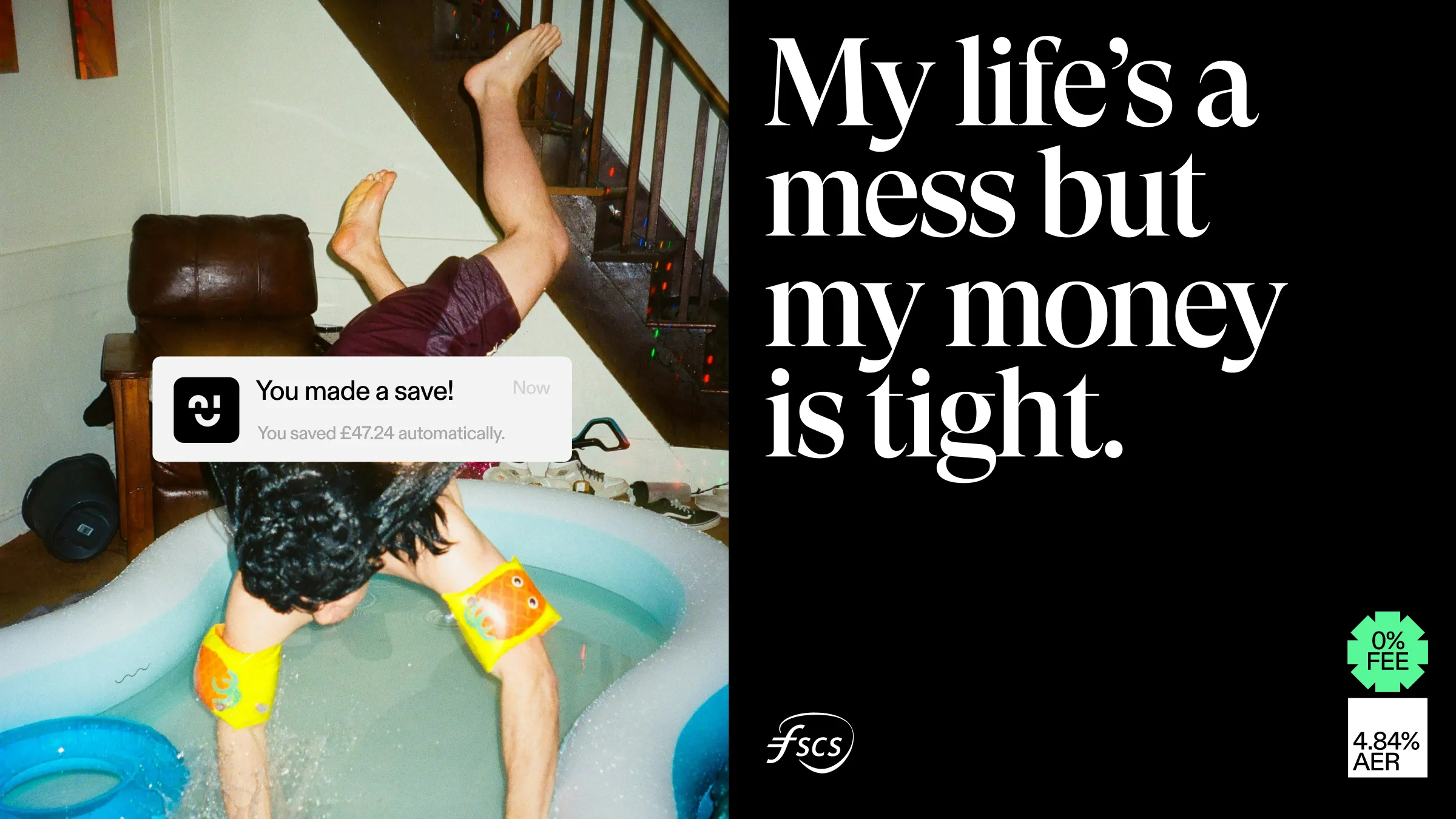
The photography grounds the brand in authenticity, depicting real people in day-to-day environments, and highlighting Chip’s understanding of the personal drivers of our biggest and most impactful financial decisions.
The overall experience communicates financial expertise, ease of use and a return to the human aspects of personal finance.


